Web design for psychologists

Calm, clear websites for psychologists.

Choosing a psychologist is a private, unhurried decision. People read, leave, and come back, sometimes for weeks, looking for credentials, a sense of the person, and the practical shape of an appointment before they reach out.

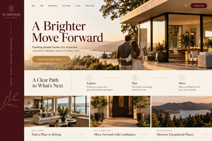
Fictional psychologists website homepage design concept
A design concept for a fictional brand. Your site is designed from scratch around yours.

Your customer's story

She reads the same page four times

Mónica's son Sebastián is nine, funny, and a puzzle to his third-grade teacher, who suggests an evaluation to understand how he learns. Mónica writes down the word the teacher used and searches it that night after he is asleep. She finds a psychologist's site, reads the about page, and closes the tab. Over the next week she comes back to it three more times.

Each time she looks for something different. First the psychologist's license and experience with children. Then a page explaining what an evaluation involves: the appointments, the testing, the feedback meeting, and the written report. Then the fees, the insurance note, and whether the feedback meeting can happen in Spanish so her mother can join. Every answer is there, written calmly, with nothing promised about what the evaluation will find.

On the fourth visit she fills in the contact form: her name, her email, and "evaluation for my son" chosen from a short list. Nothing more is asked. She also notices a quiet line in the footer about what to do in an emergency, and it makes the practice feel careful. A psychologist's website earns the first message by letting people decide in their own time.

Why it matters

Why psychologists need a website.

People rarely contact a psychologist on their first visit to a website. They read the about page, check the license, look at session formats and fees, close the tab, and return later. Parents researching an evaluation for a child do the same, comparing what each practice includes. A directory profile squeezes you into a template beside dozens of others. Your own site can set the tone, explain your scope honestly, and let people decide at their own pace.

We build psychology sites that are calm to read and specific about scope. Your credentials, license, and areas of practice are stated plainly. Therapy and assessments get separate pages, with session formats, telehealth, fees, and insurance explained. A clear notice says the practice cannot respond to emergencies and gives 911 and the 988 crisis line. The contact form asks only for a name, a way to reach the person, and whether they are asking about therapy or an evaluation.

What your customers search for

  • psychologist near me
  • child psychologist Miami
  • psychoeducational evaluation
  • spanish speaking psychologist
  • psychologist that takes my insurance
  • online therapy with a psychologist

Your customers

What people weigh before contacting a psychologist

  • Is this psychologist right for what I need?

    Your degree, license, training, and areas of practice in plain words, so visitors can judge the fit without wading through academic language.

  • What does an evaluation actually involve?

    A page for each type of assessment you offer, explaining the appointments, the feedback meeting, and the written report, without predicting any findings.

  • Do I have to explain everything in the first message?

    A short contact form that asks for a name, contact details, and a general reason from a short list, with a note that details can wait.

  • What if I am in crisis right now?

    A plain notice on every page that the practice is not an emergency service, with 911 and the 988 Suicide and Crisis Lifeline listed.

What we build

What a website for psychologists should include.

  • Credentials page

    Degree, license number, training, memberships, and areas of practice, listed accurately and approved by you before launch.

  • Therapy and assessment paths

    Separate pages for ongoing therapy and for evaluations, each explaining who it is for and how the appointments run.

  • Session formats and fees

    In-person and telehealth options, session length, fees, insurance or out-of-network billing, and your cancellation policy, all stated plainly.

  • Emergency notice

    A clear line on every page saying the practice cannot respond to crises, pointing visitors to 911 and the 988 crisis line.

  • Low-pressure contact form

    Name, phone or email, preferred contact method, and a general reason. No symptoms, history, or personal story requested.

  • Client portal link

    A button to the practice management system you use for intake, scheduling, and secure messaging, kept apart from the public site.

Planning guide

How should a psychologist set up a private practice website?

A psychology practice website is read slowly and often more than once. Visitors are deciding whether to trust a stranger with something personal, or with their child. The site should be calm, accurate, and honest about scope. Here is how we plan the pages, what to show, how people reach you safely, and how the practice gets found.

Separate therapy from assessment

Many psychologists offer both ongoing therapy and formal evaluations, and visitors arrive looking for one or the other. Give each its own page. For therapy, describe the populations you work with, your general approach, and session formats. For assessments, explain the purpose, the number of appointments, the feedback meeting, and what the written report covers. Keep every description general, promise no findings or outcomes, and approve each line yourself.

Let your credentials and tone do the work

Visitors check credentials, so state your degree, license, training, and areas of practice exactly. A professional photo and a few paragraphs in your own voice help people sense whether they would feel comfortable in the room. Photos of the office, the waiting area, and the entrance help too. Skip client testimonials, which many psychologists avoid for ethical reasons, and let clear, careful writing build trust instead.

Make first contact safe and simple

The contact form should ask for a name, a phone number or email, the preferred way to be reached, and a general reason, such as therapy for an adult, therapy for a child, or an evaluation. It should not ask for symptoms, diagnoses, or history. Say how soon you usually respond, and that intake paperwork comes later through your client portal.

Every page should state that the practice cannot respond to emergencies. Put 911 and the 988 Suicide and Crisis Lifeline in plain view, near the contact form and in the footer. This protects visitors, sets expectations, and keeps urgent situations away from a voicemail box that may not be checked until morning.

Help the right clients find you

People search for a psychologist near me, a child psychologist, a psychological evaluation, or a psychologist who speaks their language. A page for each area of practice and each type of assessment gives search engines specific matches. Keep your name, address, and phone consistent with your Google Business Profile, and say whether you see clients in person, by telehealth, or both. No site can promise a ranking, but clear structure helps.


In your market

Built for psychology practices in South Florida

Many South Florida families look for a psychologist who can work in Spanish, and parents often want evaluations and feedback meetings in the language spoken at home. Busy schedules and long drives make telehealth a common first choice, where your license allows it. Schools across Miami-Dade and Broward send families looking for assessments, and some plan them around the school calendar. We present languages, formats, and assessment details plainly, keep the emergency notice visible, and can add a Spanish version.

Questions

Questions psychologists ask us.

Should a psychologist's website include client testimonials?

Many psychologists choose not to use them, and the APA ethics code says psychologists do not ask current therapy clients for them. We build trust in other ways: clear credentials, a thoughtful about page, honest descriptions of your work, and practical details. If you want reviews shown, we talk through the options with you first.

Where should the emergency notice go on a psychology practice site?

In two places at least: near the contact form and in the footer of every page. It says plainly that the practice cannot respond to emergencies and gives 911 and the 988 Suicide and Crisis Lifeline. If you already use a preferred wording, we use yours.

Can our psychology website explain assessment fees and insurance?

Yes. We write a page from your notes covering session fees, assessment fees if you choose to publish them, the insurance plans you accept, and how out-of-network clients can request paperwork for reimbursement. You approve every figure and phrase, and we update the page whenever your policies change.

Can clients book a consultation with the psychologist online?

If your practice management system offers online booking for consultations, we add its link. Otherwise the contact form takes a name, contact details, a preferred method, and a general reason. Intake forms and anything clinical stay in your client portal, never in an ordinary email.

Let's talk

Ready for a website built for psychologists?

Tell us about your business and we will come back with a clear recommendation and a fixed quote. No pressure, no jargon.

Trades we design for

See all 226 trades

226 trades

  • Plumbers website design concept
CallFree quote